Jack Bradley Vaught • April 4th, 2018
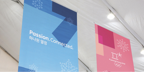
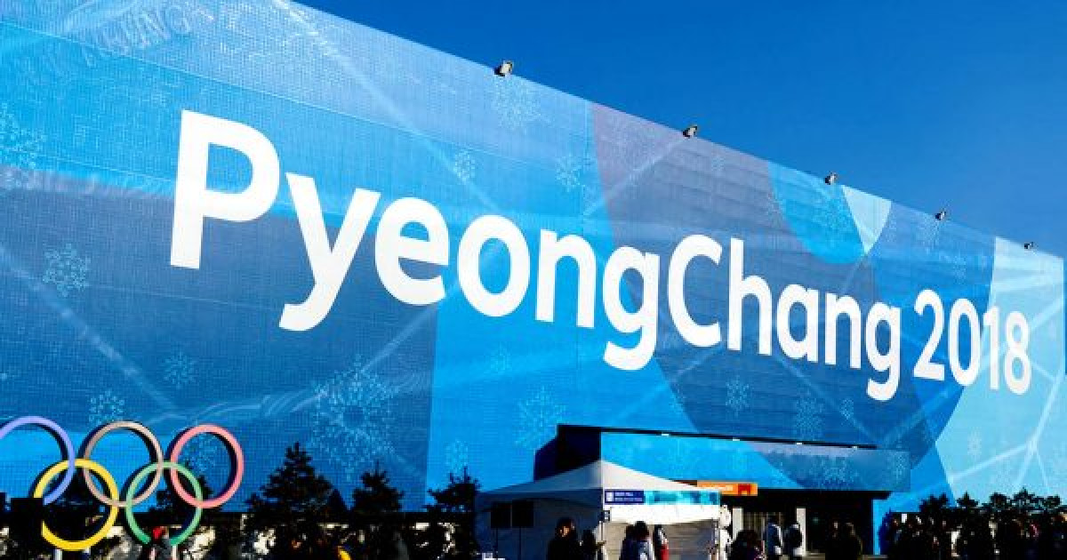
Interbrand’s eye-catching design at the PyeongChang Olympics showcased Korean culture with vibrant colors and icons embedded with the Korean alphabet. Their design modelled the power of connection by using the Hangul-a language, created in the 15th century to promote widespread literacy. Consisting of various representations of the language, the brand used words so large that they seemed to be random shape designs, and so small as to look like snowflakes scattered across the event.

Every detail of Interbrand’s design promoted the connection of countries and people. The layering of letters and colors symbolize the overlapping of cultures to inspire something brilliant and new. Their tagline, “Passion. Connected.” embodies the purpose of the Olympics itself: to chase passion alongside one another, despite our differences.
Interbrand’s Chief Creative Officer, Andy Payne, commented that “Interbrand’s Seoul’s work for the PyeongChang 2018 Olympic Winter Games is the perfect example of connecting the unique culture of Korea with the celebration of human achievement and potential for the future.”

Read more about the strategy on Interbrand’s website.
http://interbrand.com

